The Current Trajectory Of Confirmed Covid-19 Cases In America
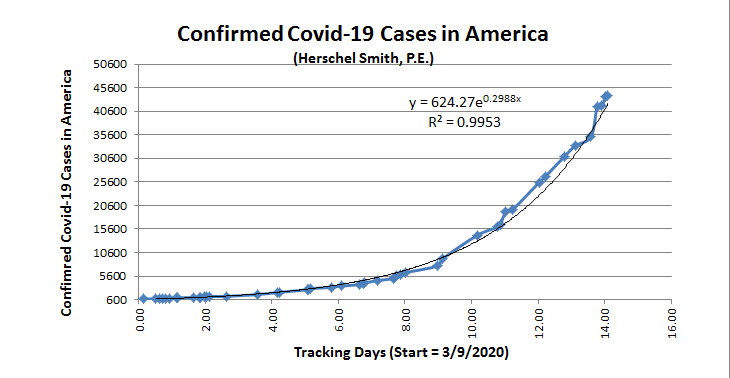
BY Herschel SmithIn my ongoing coverage and analysis of Covid-19 in America (updated almost daily), I included a much earlier graph with a curve fit, at the time, exponential and with a very high correlation coefficient. The graph from 3/23 looked like this.
The doubling time was computed as:
ln(2) / 0.2988 = 2.32 days
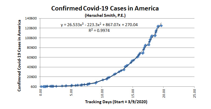
The graph has been unsettled lately, until last night and today. I have received requests to update the curve. I said I would have to jettison the exponential curve fit and go with a polynomial (see original post), and today I did that. The exponential model was massively over-predicting cases going forward and the correlation coefficient had begun to degrade. The revised curve is below.
There is a remarkable difference. The doubling time depends on where you are on the graph. It’s a third-order polynomial. Currently, the doubling time is 4.1 days, versus the value of 2.32 days computed not too many days ago. The correlation coefficient is very high, and the curve is stable and well-behaved.
Here I am not weighing in on or performing analysis of the reasons for this. There could be many, or only one, or some combination of causes. Some readers may posit “social distancing,” others may point out that the testing rate has change because slightly symptomatic patients are not being tested, others may postulate that herd immunity may be playing a factor (i.e., it’s possible that many millions of Americans have already been exposed to and infected with the virus and had little to no problem with it), and still others may postulate that PPEs, hygiene protocol and the reluctance to go to hospitals may be playing a role (my own daughter, a surgical NP and first assist who also has to spend copious time in the ER) observes that numbers of patients entering hospital care is down.
Again, I am making no claim whatsoever as to reasons for this. I am only mathematically modeling this phenomenon, and I can conclusively say that there is a remarkable difference between doubling time and trajectory today and a week ago.
UPDATE:
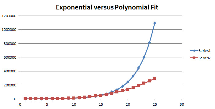
Per request, this is a picture of the previous exponential fit versus the polynomial fit. It’s QAD (quick and dirty), with no bells and whistles.
With more time I could write Macros to make this much better with various data analytics options, but I’m not paid to do this analysis.


On March 29, 2020 at 12:57 pm, James R. Phillips said:
Please log the data, and fit the logged data. This will make it easier to see the changing slope that corresponds to a changing doubling time.
Thanks
On March 29, 2020 at 1:00 pm, Herschel Smith said:
@James,
The data set is large and not amenable to posting. I could overlay the lots against each other, which may help to visualize what I’m saying better.
On March 29, 2020 at 1:14 pm, hugh smith said:
There has been a large increase in testing over the last 10 days. We saw in China a jump in cases when they changed their testing/reporting methodology. What is the effect of testing and the identification of non-symptomatic cases on the estimated doubling period?
On March 29, 2020 at 1:15 pm, Bill Wynn said:
Please overlay the two data plots to allow a visualization of the differences.
On March 29, 2020 at 1:17 pm, Bill Wynn said:
When the page refreshed after my comment the plots became visible. Thank you.
On March 29, 2020 at 2:42 pm, Eric S. Raymond said:
I don’t think either an exponential or polynomial is really appropriate here. You ought to be fitting to a logistic sigmoid, or better yet a Gompertz curve.
On March 29, 2020 at 2:59 pm, G Hansen said:
Is there any way to find and present total tests given daily so we might bring in testing volume as driver in addition to contagion?
On March 29, 2020 at 3:27 pm, Herschel Smith said:
@Eric,
I disagree on Gompertz curve (EDIT: Hmm … depending upon whether I leave this cumulative confirmed cases or active cases, I’ll have to think about that, may make a change, or begin logging active cases which would be confirmed – recovered). A sigmoid plot might be a good idea and it’s one I can throw in. But it’s a bit pedantic to suggest that a curve fit that I have at the moment USING HISTORICAL data, with an R^2 of 0.9974, isn’t good enough to the simple purpose for which I’ve built it.
I’m not pretending to know how this curve will behave in the far-flung future, and I don’t really think you know either.
On March 29, 2020 at 3:59 pm, G. Hansen said:
here’s data for testing … you can download in .csv file for simple comparison to case growth … doing my own analysis but it looks like testing growth is outstripping case growth, which is interesting
https://covidtracking.com/api/
On March 29, 2020 at 5:28 pm, Larry Bieber said:
You raise an interesting point about the effects of the shelter in place on the increase in cases. The SF Bay Area shelter in place was effective Marcy 17th. Is it possible to compare the increases in SF Bay Area Covid 19 cases with areas that implemented shelter in place orders later to determine the effect of shelter in place? Here is some data from the SF Chronicle https://projects.sfchronicle.com/2020/coronavirus-map/. The increase in the number of cases is decreases. I am not sure if the trend has lasted long enough for statical significance but it is encouraging.
On March 29, 2020 at 6:22 pm, Ned2 said:
@ Hugh, and others who are still considering Chinese data.
We have absolutely no reassurance nor reason to think anything the Chinese have been telling us from the start is the truth.
We have to focus on data from trusted sources only to get an idea where this thing’s going, namely Europe, and western countries offer cultural similarities as well which will help us plot the path of this thing.
The 4 day doubling right now translates to 32,000,000 people having this by the end of April, and if I’m not mistaken, the quarantine has not (so far) stopped the “curve”.
If we could establish a mortality rate, that would be great, but it’s mathematically impossible at this point. All we can do is collect data and wait until this passes, at which point we can come up with a realistic mortality rate estimate. (the only way to have an empirical number for CFR is to test every living person in the country, including corpses, for the disease).
Y’all can extrapolate what 32Million cases could mean for this country.
On March 29, 2020 at 6:24 pm, Paul B said:
You are depending on misreported numbers. I don’t think anyone is publishing number that are anything true.
Reason I say this is one of the most trusted health site had to change the x axis to juice the numbers. There reported total case by country, with the US being the largest number then they did the healed and dead by state. only for the US.
Not sure why but anytime you do not keep the scale the same any cross comparison is not valid.
look for yourself https://coronavirus.jhu.edu/map.html
On March 29, 2020 at 6:43 pm, xtron said:
bottom line….per your numbers and graphs….if they are correct, and hold up near future….
the curve is being flattened.
good job to all involved.
On March 29, 2020 at 6:50 pm, Herschel Smith said:
@Paul,
I haven’t had any tracking of data for China from the beginning. I haven’t claimed to. Look again at the graph. It says confirmed Covid-19 cases in America. China is IRRELEVANT to this analysis. All kinds of laws superintend what is reported concerning that (cases in America). It gains a hospital absolutely nothing to misrepresent a Covid-19 case under their watch except to be in violation of federal law.
I don’t know anything about “juicing” any numbers. If you’re suggesting malfeasance on the part of someone, bring your evidence.
On March 29, 2020 at 11:33 pm, Dan said:
This graph will end up as a bell curve…..once it peaks it will drop just as fast. The only thing we don’t know is how high up the peak will be but
history shows this to be the case for this type of infectious disease.
On March 30, 2020 at 10:26 pm, wilson said:
virus incidence is well known, the CDC has curves of incidence on flu spread in the USA going back 30 years. They all act about the same, the first 12 weeks the spread is just starting and the data is jumpy and predictions are unreliable. Then it takes off and the second 12 weeks the number of cases increase in a methodical manner peaking around the 12 week point, then it drops to near zero over the next 12 weeks. Think about that when you try to play infectious disease expert.
This years flu has far far exceeded covid in terms of cases, hospitalizations, deaths. This flu season – 54,000,000 cases, 21,000,000 medical visits, 400-730,000 hospitalizations, 24-62,000 deaths. The range is because some patients have other illnesses as well as the flu and its hard to state the primary reason for hospitalization/death.
But lets all fall for the media inspired hysteria and think covid is the plague.
On March 30, 2020 at 10:33 pm, Herschel Smith said:
@wilson,
Good job of completely missing the point. The public gets a say in this due to social behavior.
Neither I nor you knows what this curve will look like when it’s all said and done. Nor does the CDC. If anyone claims they know what this will look like in the future, they’re a liar.
You could have reviewed the math. Instead, you did nothing but bitch. Thanks for adding nothing at all to the discussion.