BY PGF
 3 years, 10 months ago
One month ago, we showed you a pattern that was forming in the stock market that could signal bad times ahead. That pattern appears to have completed signaling deep losses to come in the stock markets. A recession, if the pattern holds, is predicted.
Here is the chart today:

A “Head and Shoulders” pattern has formed, signaling a significant reversal from the prior trend. In English: stocks were going up, now they will go down. The major indexes have already started moving lower. Everything could change when the markets open tomorrow, but the trend has reversed downward.
Couple the pattern with the macroeconomic environment, especially inflation due to wild money printing after the Trump lockdowns, and you have a lousy recipe.
These things take on a life of their own. Every time is different despite the commonalities. This could be the final straw in the 100 years long money changers and war profiteers racket at the central banks. Or, it could be a very mild recession, and soon inflation abates. Momentum has its unique attributes, causing exaggerations both up and down. It could get nasty, and likely will, before it gets better. We just thought you should know.
BY PGF
 3 years, 11 months ago
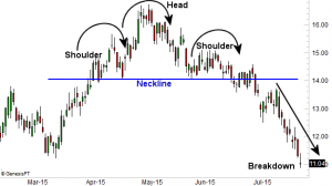
The “Head and Shoulders” stock market pattern usually indicates a reversal of the prior trend in (a) stocks.
Charts are read from left to right. Here is an example illustration:

“The Head and Shoulders pattern is one of the most widely recognized reversal patterns and one of the most reliable bearish signals when found in uptrends, thus signaling the end of its [Bull Market] run.”
“The reason why it’s called a Head and Shoulders is because the first high (left Shoulder) and third or last high (right Shoulder) are both lower than the second or middle high (Head), making the pattern look vaguely like a silhouette of a person’s head and shoulders. A trendline can then be drawn connecting the lows after the first two peaks and extending it out to the right. This trendline is called the ‘Neckline’.” – Quote from a Zacks technical paper on stock market patterns.
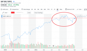
Here we are in the S&P broad market index:

The pattern is circled, and a thin red line indicates the top of each shoulder. April 2020 was the Trump lockdown bottom. The market went up until September of last year; that’s when the pattern started to form. The second “right” shoulder appears to be developing now. It could break the second shoulder to the upside, continuing the bull market run. But things don’t look good; you know the macro; inflation, war, money printing, dollar losing global confidence, potential food shortages, etc. The market doesn’t always break down when this chart pattern prevails, but we just thought you might need to know that it usually does.
Edit: Read this SitRep on Europe over the weekend. WRSA laments; “Where Are The American-Sourced Discussions On These Issues?” Yep, reading Americans about the situation over there is a total waste of time.
